Restyling brand identity / Web development
A new image for a contemporary identity that strikes at first glance
A redesign that solves the brand’s technical issues
Brand analysis to identify aspects that needs to be improved
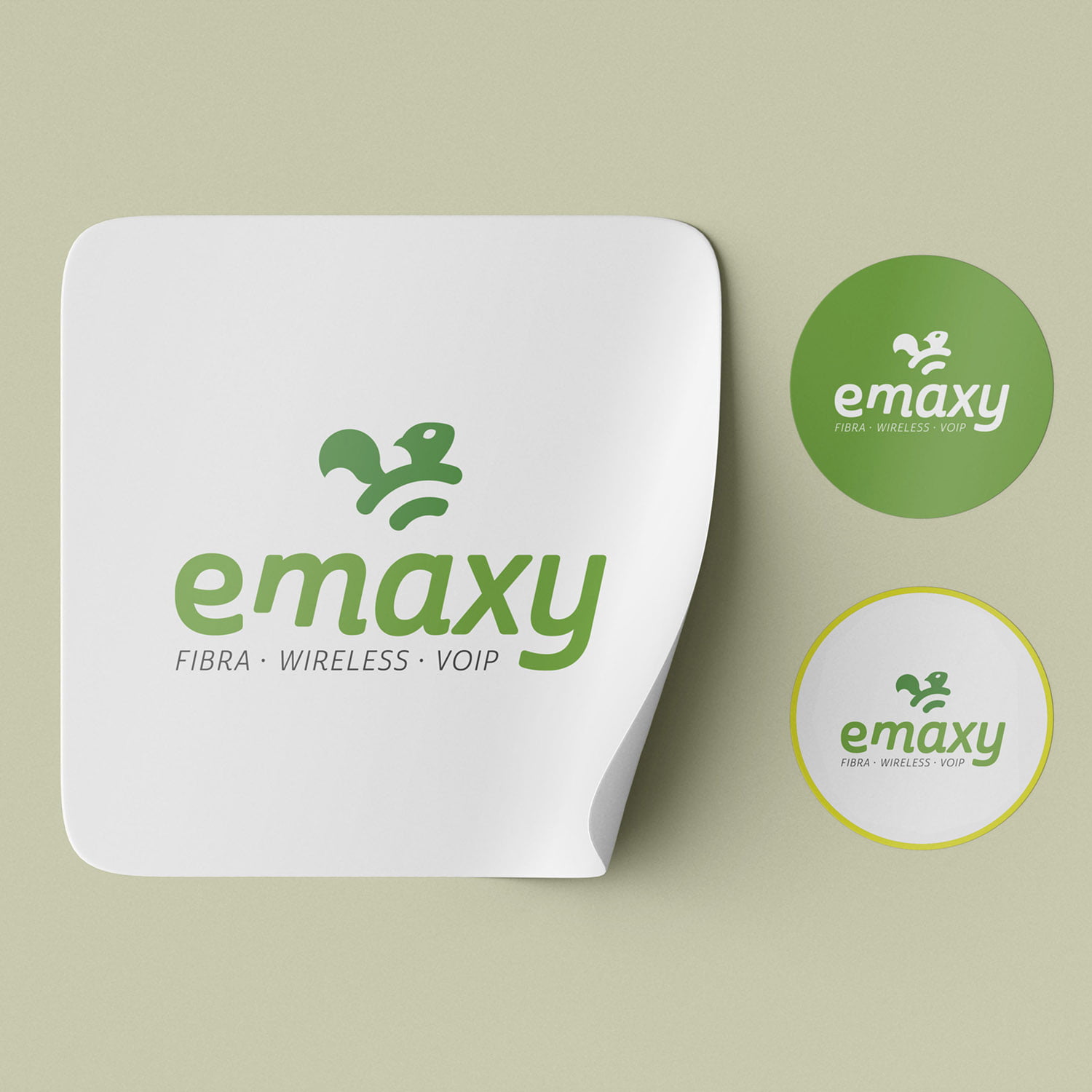
We analyzed the existing Emaxy logo, noting some issues: the pictogram was small compared to the logotype, and the style did not match the font.
The pictogram, consisting of the Wi-Fi network icon, is widely used in the sector, failing to create a recognizable visual identity.
The pictogram, consisting of the Wi-Fi network icon, is widely used in the sector, failing to create a recognizable visual identity.
A new concept to enhance the image of a company whose mission is the quality and rapidity of customer assistance.
We defined the keywords for the design of the new logo: future, technology, reliability, speed, trust.
We identified the squirrel as a symbol of these corporate values: it’s active, fast, thought, with great adaptability. It can find ingenious solutions to problems, even sudden ones. We have thus created a new pictogram with elegant shapes.
The logo has been modernized using a contemporary font and with the inclusion of some distinctive graphic features.
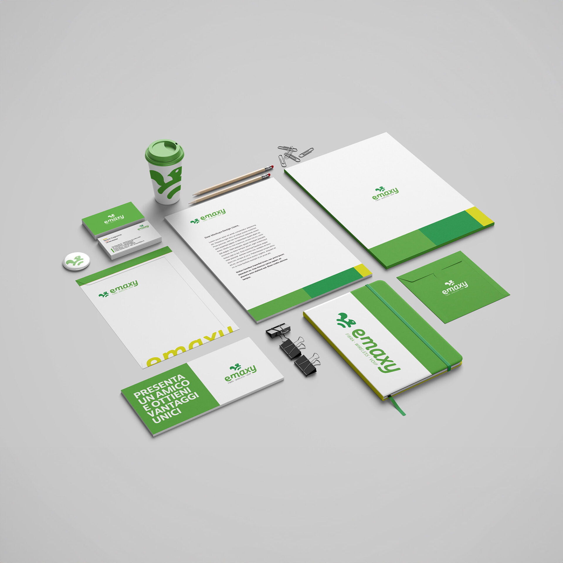
From logo design to corporate identity
After the logo redesign and the definition of its use rules, we worked to create the rest of Emaxy’s visual communication, from advertising posters to letterhead, in order to give coherence to the corporate image and adapt it to the level of the services provided by Emaxy.

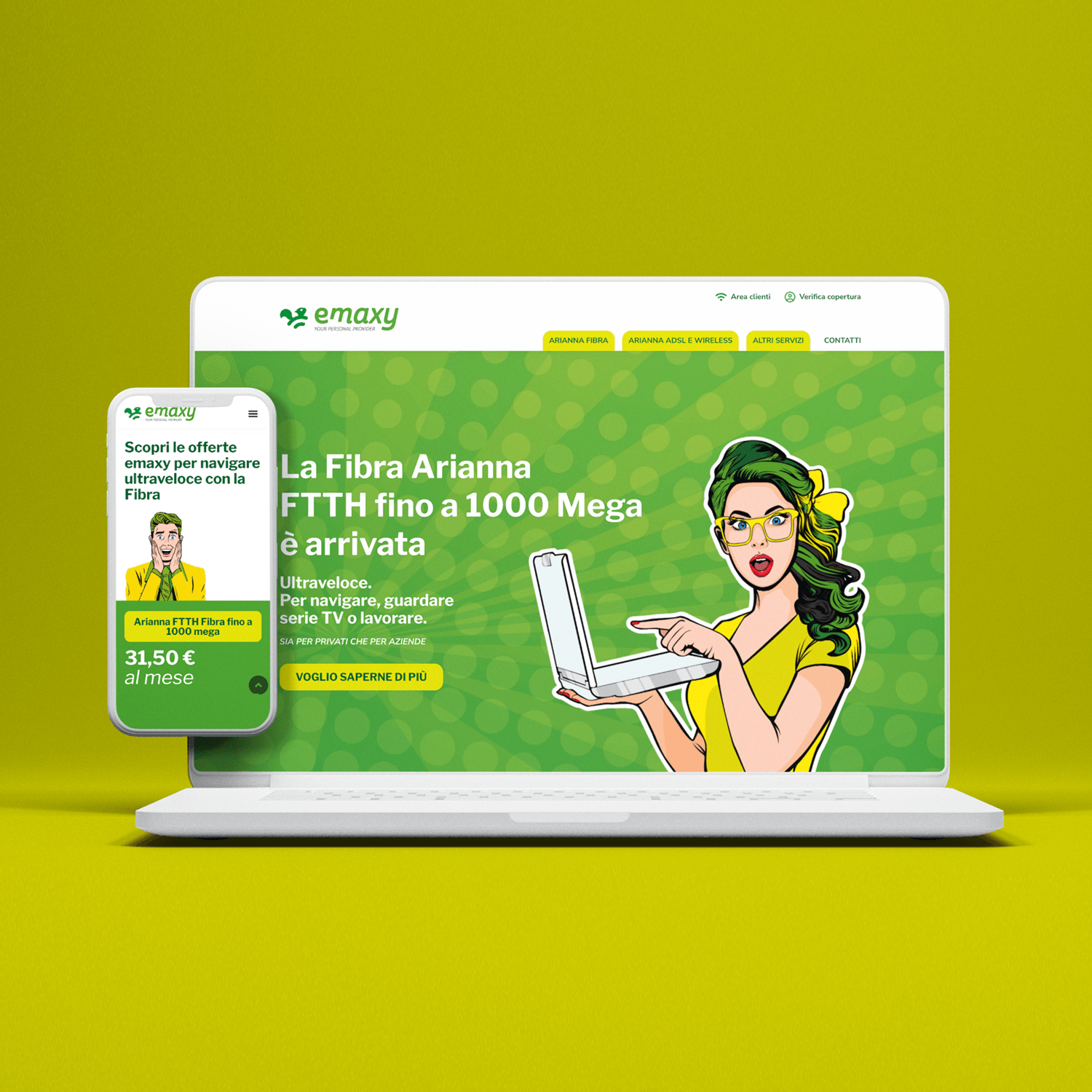
A new design and a new structure also for the website
We rdesigned the new website architecture keeping in mind the user needs, dividing the menu into three macro areas to help choosing the most suitable service to deepen.
The design is customized with cartoon characters, with a pop-art style.
The design is customized with cartoon characters, with a pop-art style.