Logo restyling / site design and development
New brand identity to enhance a successful tourist business
Camping Le Fonti
A fresh and modern design which maintains the original concept
Same key concepts: nature, outdoor life, spas, family, well-being. Same colors: the blue of the water and the orange of the sun.
The new brand identity started from here and aimed to create a more modern and professional mood. We have therefore redesigned the graphic lines of the logo which remains recognizable and which, thanks to the construction grid and the balance of shapes, makes it modern and proportionate.
In this way, technical problems related to the previous version were solved, which completely lacked the typographic study and which had imprecise strokes even in the empty spaces. The new study subsequently involved the website as well.


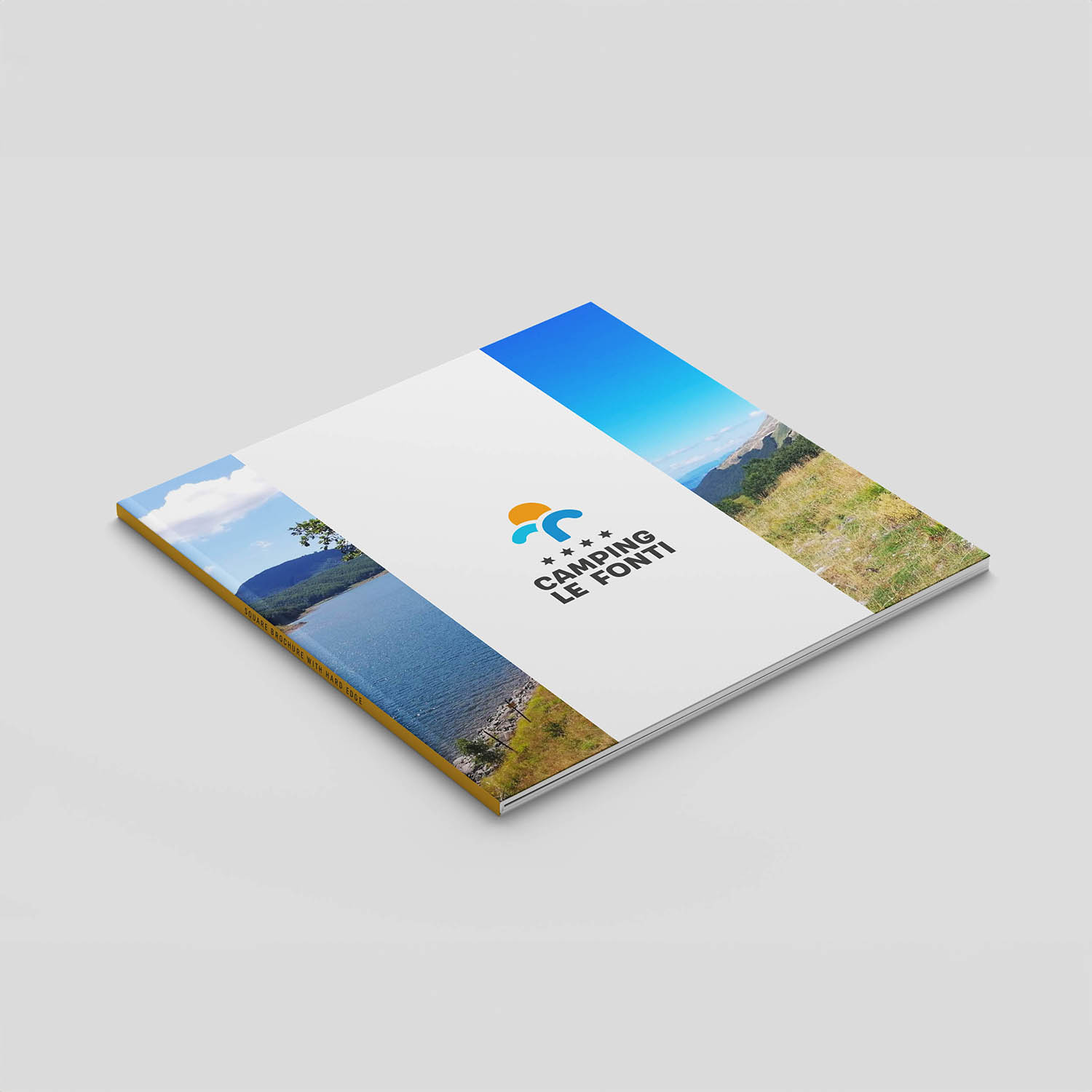
Printed materials
The logo in action
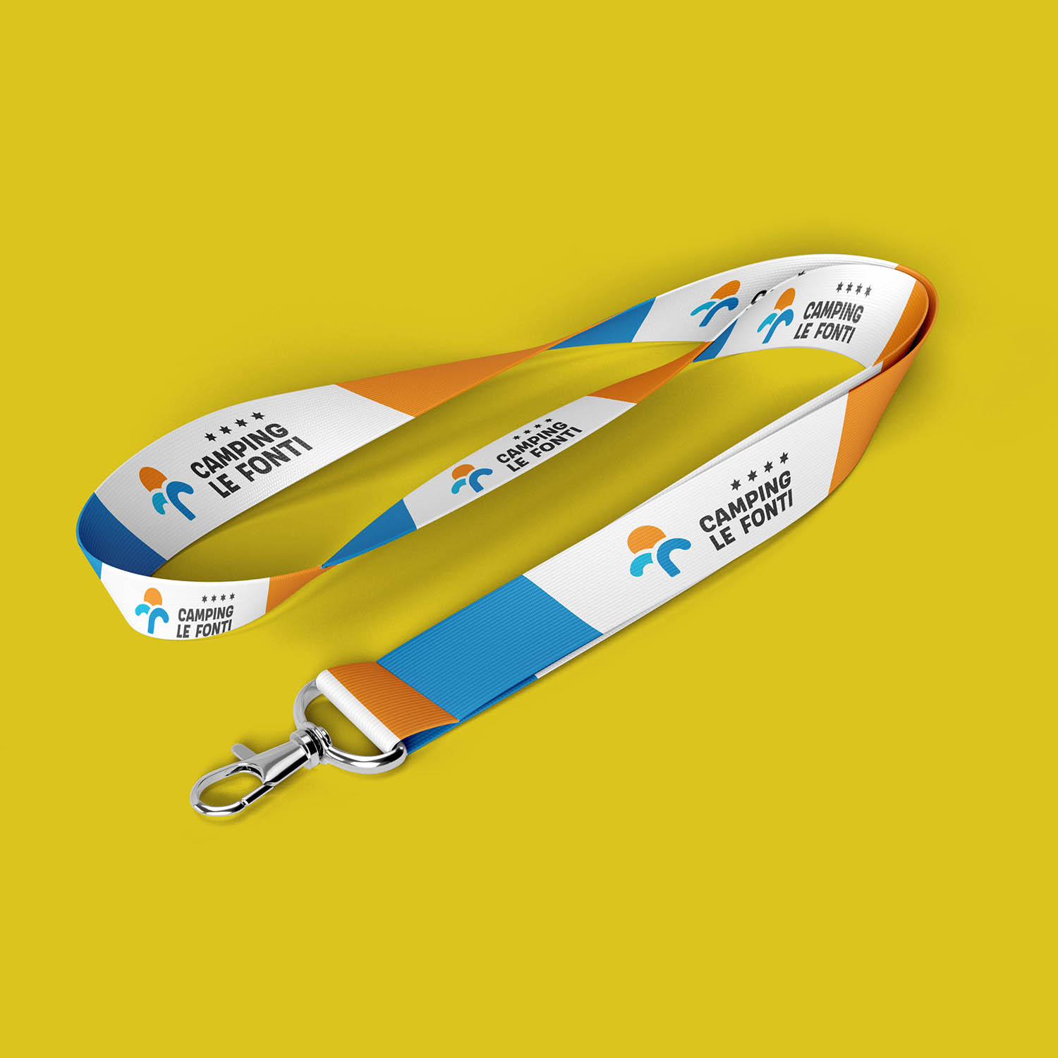
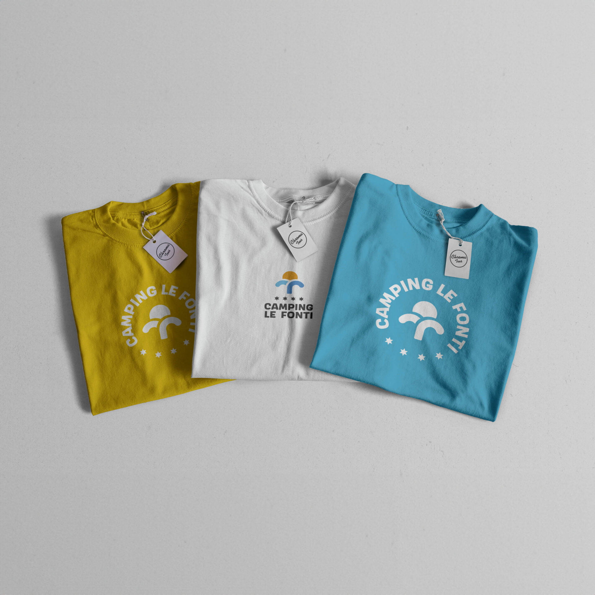
In the style guide of the logo all the possible declinations are included, both in the monochrome version and in the color version.
A good initial design allows to have a coherence of communication in all graphic productions.
A good initial design allows to have a coherence of communication in all graphic productions.
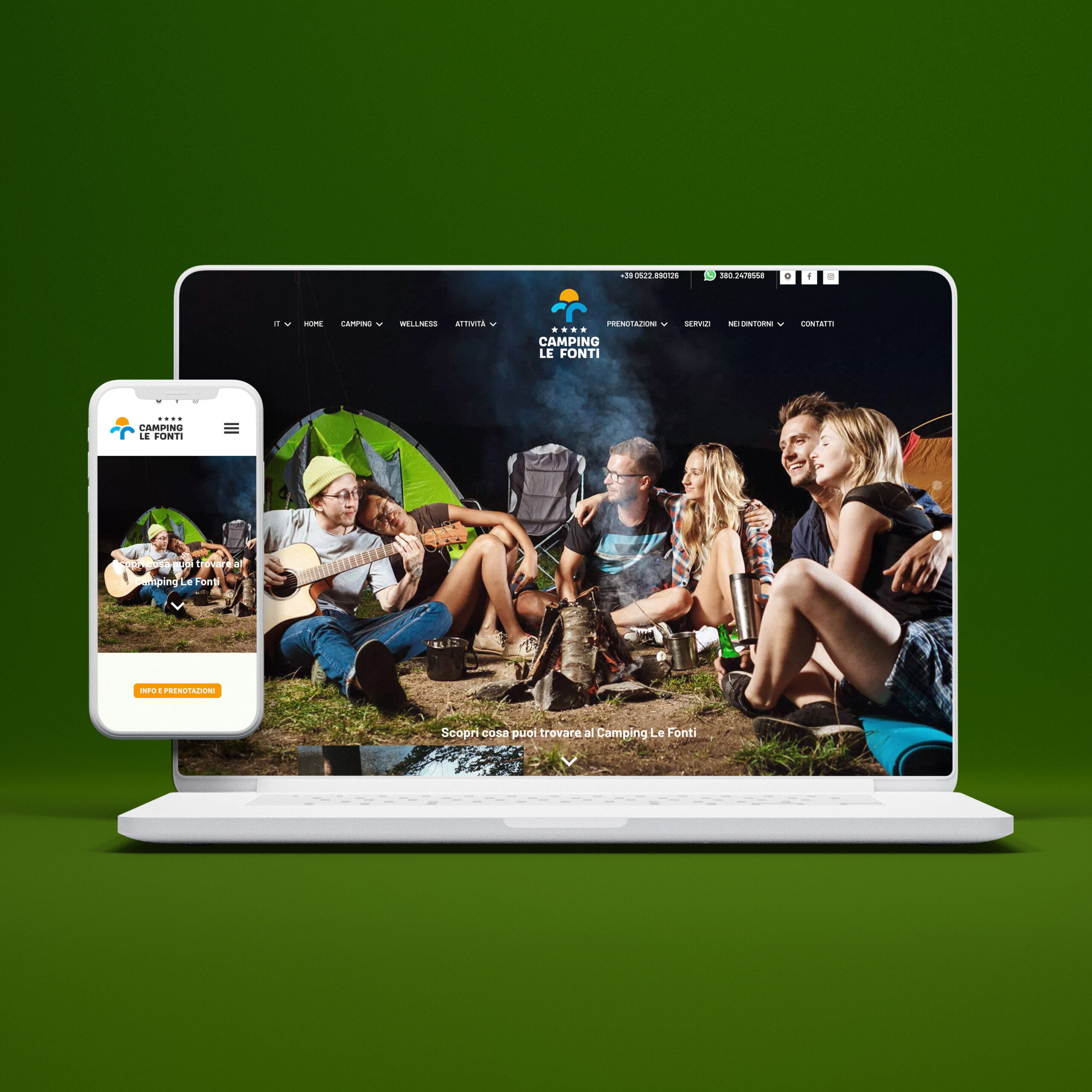
From brand to the site
A completely redesigned User Experience
From the analysis of the previous site, some structural and design problems emerged that did not consider good practices that improve the browsing experience of users. We have redesigned the structure and subdivision of the contents, in order to allow users to find the information they need with a few clicks.
